Instagram Style: Mastering Color Psychology for Emotional Posts

Advertisements
Instagram Style Deep Dive: The Psychology of Color explores how understanding color psychology can significantly enhance your Instagram presence by allowing you to evoke specific emotions in your audience, creating a more engaging and impactful visual narrative.
Want to make your Instagram posts more than just pretty pictures? Dive into the fascinating world of color psychology and discover how to use hues to evoke specific emotions. This Instagram Style Deep Dive: The Psychology of Color – How to Use It to Evoke Specific Emotions will transform your feed into a powerful storytelling tool.
Understanding the Basics of Color Psychology
Color psychology is the study of how colors affect human behavior and emotions. It’s a field that marketers, designers, and artists use to influence perceptions and create specific feelings. On Instagram, understanding these principles can help you craft a more impactful and engaging visual narrative.
Different colors evoke different responses, and these responses are often deeply ingrained in our culture and even biology. By consciously choosing the colors in your posts and overall feed, you can subtly guide your audience’s emotional experience.
The Cultural Significance of Colors
The meaning of colors can vary across cultures. For example, white is often associated with purity and innocence in Western cultures, while in some Eastern cultures, it signifies mourning. Red can symbolize passion and love in many Western countries but represents good fortune and prosperity in China. Being aware of these nuances is crucial when targeting a global audience with your Instagram content.
Understanding the cultural context of colors can help you avoid unintended messages and create content that resonates positively with your target demographic. This awareness is particularly important for brands and influencers looking to build a global presence.
- Western Cultures: White for purity, black for mourning, red for passion.
- Eastern Cultures: White for mourning (parts), red for good fortune, yellow for royalty.
- Global Brands: Need a universal understanding or a localized color palette.
Consider a brand launching a campaign in both the US and China. They might use red predominantly in the Chinese version of their campaign to leverage its positive connotations, while using a different color scheme for the US market to better align with local preferences.
Ultimately, understanding the basics of color psychology, including cultural nuances, is key to creating an Instagram feed that evokes the desired emotions and strengthens your brand’s connection with its audience.
Red: Passion, Energy, and Excitement
Red is a powerful color that immediately grabs attention. It’s associated with passion, energy, excitement, and even danger. On Instagram, using red can create a sense of urgency or highlight important information.
However, it’s essential to use red strategically. Too much red can be overwhelming and even create feelings of anxiety. Balance is key to harnessing its energy effectively.

Using Red in Your Posts
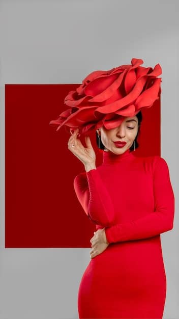
Red can be used effectively in promotional posts, product highlights, or as an accent color to draw attention to a specific element in your photo. For example, a fashion influencer might wear a red dress to showcase a bold and confident style, or a food blogger might highlight a vibrant red sauce in a pasta dish.
Consider using red in your Instagram Stories to announce a sale or promotional event. The color’s inherent sense of urgency can encourage viewers to take immediate action. However, avoid using red excessively, as it can tire the eyes and diminish its impact.
- Promotional Posts: Highlight sales and special offers.
- Product Highlights: Draw attention to a key feature.
- Accent Color: Add pops of energy to a neutral palette.
Imagine a makeup artist using red lipstick as the central focus of a beauty tutorial. The vibrant color not only enhances the model’s features but also conveys a sense of confidence and glamour, making the post more engaging and memorable.
In conclusion, red is a versatile color that can add passion and excitement to your Instagram feed, but it’s crucial to use it thoughtfully and strategically to achieve the desired effect without overwhelming your audience.
Blue: Calm, Trust, and Serenity
Blue is often associated with calm, trust, serenity, and stability. It’s a color that evokes feelings of peace and security, making it ideal for brands and influencers looking to build trust with their audience.
In the digital world, where trust can be hard to come by, using blue tones consistently can help establish a sense of reliability and professionalism. This is particularly important for businesses in the finance, healthcare, or technology sectors.
Incorporating Blue into Your Feed
Blue can be incorporated into your feed through blue skies in landscape photos, calming ocean scenes, or even blue-toned filters. A travel blogger might use blue hues to convey the tranquility of a beach destination, while a wellness influencer might feature blue backgrounds in meditation videos.
Consider using blue in your brand’s logo or color palette to convey a sense of trustworthiness and competence. Many tech companies use blue in their branding to signal stability and innovation. Avoid using overly saturated or artificial shades of blue, as these can sometimes feel cold or distant.
- Landscape Photography: Show calm and peaceful scenes.
- Wellness Content: Create a serene and relaxing atmosphere.
- Brand Aesthetics: Signal trust and professionalism.
For instance, a financial advisor might share an Instagram post with a blue-toned cityscape in the background. The calm color helps create a sense of financial stability and reassurance, aligning with the advisor’s mission to build trust with clients.
To sum up, blue is a powerful color for establishing trust and conveying a sense of calm on Instagram. By strategically using blue tones in your content, you can build a stronger connection with your audience and reinforce your brand’s message of reliability and serenity.
Yellow: Joy, Optimism, and Energy
Yellow is the color of sunshine, associated with joy, optimism, and energy. It’s a vibrant and cheerful color that can instantly brighten up your Instagram feed and lift the spirits of your followers.
Incorporating yellow into your posts can create a sense of positivity and enthusiasm, making your content more appealing and shareable. However, it’s essential to use yellow in moderation, as too much yellow can be overwhelming or even associated with caution.
Creative Ways to Use Yellow on Instagram
Yellow can be used effectively in food photography, fashion shots, or as an accent color in minimalist designs. A food blogger might showcase a vibrant yellow dessert, while a fashion influencer might wear a yellow dress to exude a playful and energetic vibe.
Consider using yellow in your Instagram Stories to announce a fun event or a contest. The color’s cheerful energy can make your announcement more engaging and memorable. However, be mindful of the shade of yellow you use, as certain shades can be visually jarring.
- Food Photography: Highlight vibrant and appetizing dishes.
- Fashion Shots: Exude a playful and energetic vibe.
- Minimalist Designs: Add a touch of optimism and brightness.
Imagine a lifestyle blogger posting a picture of a bright yellow bouquet of flowers. The cheerful color conveys a sense of happiness and optimism, enhancing the post’s appeal and making it more shareable.
In conclusion, yellow is a fantastic way to inject joy and optimism into your Instagram feed. By strategically using yellow tones in your content, you can create a more positive and engaging experience for your audience, making your posts more memorable and uplifting.

Green: Growth, Health, and Nature
Green is a color closely associated with growth, health, nature, and harmony. It evokes feelings of tranquility and symbolizes new beginnings, making it an excellent choice for influencers or brands focusing on sustainability, wellness, or outdoor adventures.
Incorporating green into your Instagram aesthetic can communicate a sense of balance and renewal, drawing in followers who value environmental consciousness or strive for a healthy lifestyle.
Using Green to Enhance Your Content
Consider featuring lush green landscapes, healthy food recipes with green ingredients, or eco-friendly products in your posts. A fitness influencer might showcase a workout routine in a leafy park, while a sustainability blogger could share tips on reducing waste with images of flourishing plants.
You can use desaturated or muted greens to create a calming and serene feel or opt for brighter, more vibrant greens to convey energy and excitement. However, it’s crucial to balance the use of green with other colors to maintain visual harmony.
- Sustainability Content: Showcase eco-friendly practices and products.
- Wellness and Fitness: Highlight healthy lifestyle choices and outdoor activities.
- Nature Photography: Evoke a sense of tranquility and environmental awareness.
For instance, an organic skincare brand might feature a product surrounded by fresh green leaves. This visual association reinforces the brand’s commitment to natural ingredients and environmental responsibility, strengthening its connection with eco-conscious customers.
In essence, green is a versatile color that can add a touch of nature and tranquility to your Instagram feed. By strategically using green tones in your content, you can attract an audience that values sustainability and holistic well-being, enhancing the impact of your visual storytelling.
Purple: Luxury, Creativity, and Mystery
Purple is often associated with luxury, creativity, mystery, and royalty. This color holds a unique place in the spectrum, blending the energy of red with the calmness of blue. On Instagram, it can be employed to convey a sense of sophistication, inspire imagination, or add an element of intrigue.
Brands looking to communicate exclusivity or artistry, as well as influencers focusing on fashion, beauty, or creative arts, can strategically incorporate purple into their visual storytelling to elevate their brand image.
Ways to Intrigue with Purple
Consider using purple in makeup tutorials for theatrical or avant-garde looks, styling purple accessories in fashion editorials, or featuring purple-toned artwork in inspirational posts. An artist might showcase a vibrant purple abstract painting, while a beauty guru could demonstrate how to create a stunning purple smokey eye.
You can use various shades of purple to achieve different effects. Lighter shades like lavender or lilac can evoke a sense of romance and tenderness, while darker shades like plum or eggplant can convey power and drama. Consider using purple to create an air of exclusivity around a limited-edition product or offering.
- Fashion Content: Convey elegance and sophistication with striking purple accessories or apparel.
- Beauty Content: Inspire creativity and artistry with bold purple makeup looks.
- Artistic Posts: Evoke imagination and mystery with purple-toned art pieces.
Take, for instance, a high-end jewelry brand showcasing a precious amethyst necklace. The rich purple hue communicates luxury and exclusivity, attracting discerning clients who appreciate the finer things in life.
In conclusion, purple is a potent color for imbuing your Instagram content with luxury, imagination, and a touch of mystery. By thoughtfully using purple tones, you can appeal to a sophisticated audience and enhance the perceived value of your brand.
| Key Color | Emotion Evoked |
|---|---|
| ❤️ Red | Passion, Energy, Excitement |
| 💙 Blue | Calm, Trust, Serenity |
| 💛 Yellow | Joy, Optimism, Energy |
| 💚 Green | Growth, Health, Nature |
Frequently Asked Questions
▼
Color psychology can enhance your Instagram presence by helping you evoke specific emotions in your audience, making your content more engaging and impactful. It’s a powerful tool for visual storytelling.
▼
Red is great for grabbing attention and creating urgency. Use it for promotional posts or to highlight key elements, but avoid overuse to prevent overwhelming your audience. Balance it with neutral tones.
▼
Blue is generally associated with calm, trust, serenity, and stability. It’s effective for brands that want to build trust and convey a sense of reliability, making it a popular choice for finance and tech companies.
▼
Yellow brings joy, optimism, and energy to your feed. Use it in moderation to highlight food, fashion, or as an accent color in designs, creating a cheerful and inviting experience for your followers.
▼
Green symbolizes growth, health, nature, and harmony. Perfect for brands focusing on sustainability or wellness, it creates a sense of balance and renewal. Use it for landscapes and healthy recipes.
Conclusion
By understanding and applying the principles of color psychology, you can transform your Instagram feed into a powerful tool for emotional connection and brand storytelling, ultimately enhancing your influence and engagement.


