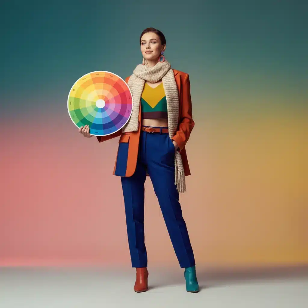
In the ever-evolving world of fashion, one constant remains: the profound impact of color. As we step into 2026, the emphasis on personal expression and conscious wardrobing is stronger than ever. Understanding color theory fashion is not just about picking pretty shades; it’s about mastering a powerful tool that can transform your entire aesthetic, elevate your mood, and communicate your unique personality without uttering a single word. This comprehensive guide will delve deep into the principles of color theory, helping you unlock its secrets to curate a closet that truly reflects the best version of you.
Forget fleeting trends that dictate what you “should” wear. Instead, imagine a wardrobe where every piece works harmoniously, enhancing your natural beauty and boosting your confidence. This is the promise of integrating color theory fashion into your daily styling. From understanding your personal color palette to creating dynamic outfit combinations, we’ll cover everything you need to know to become a true color connoisseur.
The Foundation of Color Theory Fashion: The Color Wheel Explained
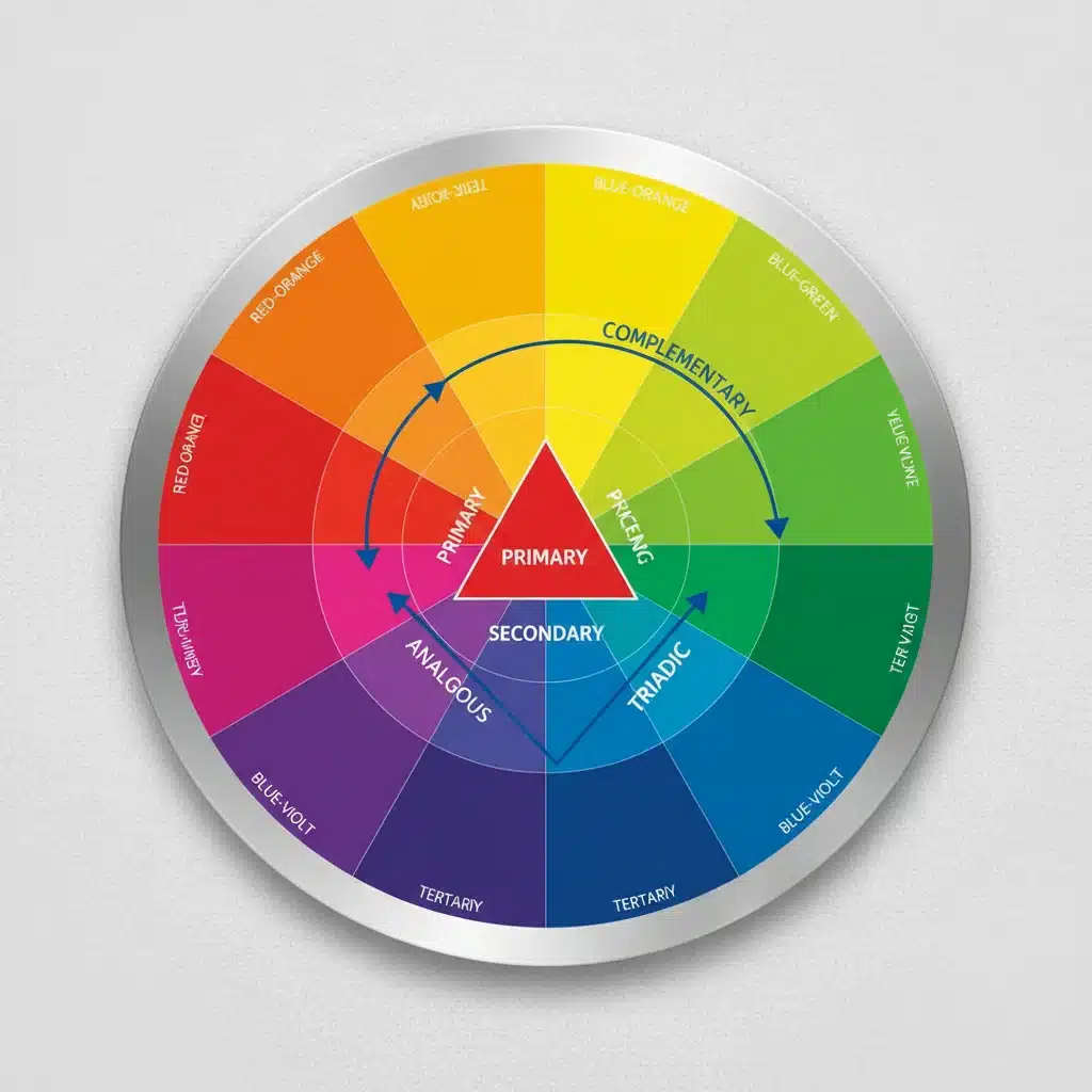
At the heart of all color theory fashion lies the color wheel – a visual representation of colors arranged according to their chromatic relationship. Understanding its structure is the first crucial step to making informed styling decisions. The color wheel is typically divided into three main categories:
Advertisements
- Primary Colors: Red, blue, and yellow. These are the foundational colors from which all other colors are derived. They cannot be created by mixing other colors.
- Secondary Colors: Orange, green, and violet (purple). These are created by mixing two primary colors. For example, red + yellow = orange.
- Tertiary Colors: Red-orange, yellow-orange, yellow-green, blue-green, blue-violet, and red-violet. These are formed by mixing a primary color with a secondary color.
Beyond these basic categories, the color wheel also introduces us to concepts like warm and cool colors. Warm colors (reds, oranges, yellows) are often associated with energy, passion, and excitement, tending to advance and grab attention. Cool colors (blues, greens, purples) evoke feelings of calmness, serenity, and professionalism, often receding and creating a sense of depth.
The interplay of these colors is what makes color theory fashion so fascinating. It’s not just about individual shades but how they interact with each other to create a cohesive and impactful visual story. By grasping these fundamental concepts, you begin to see your wardrobe not as a collection of isolated items, but as a palette waiting to be artfully arranged.
Moreover, the concept of saturation and brightness also plays a pivotal role. Saturation refers to the intensity or purity of a color. A highly saturated color is vibrant and rich, while a desaturated color is muted and closer to gray. Brightness, or value, refers to how light or dark a color is. Understanding these nuances allows for more sophisticated and personalized color choices, moving beyond just the basic hue. This depth of understanding is what truly distinguishes a skilled application of color theory fashion from a mere casual selection of colors.
Harmonious Hues: Exploring Color Schemes for Your Closet
Once you understand the basic structure of the color wheel, the next step in mastering color theory fashion is to explore different color schemes. These schemes provide frameworks for combining colors in ways that are visually pleasing and effective.
Complementary Color Schemes
Complementary colors are opposite each other on the color wheel (e.g., red and green, blue and orange, yellow and purple). When placed together, they create a strong contrast that is vibrant and eye-catching. In fashion, using complementary colors can make a bold statement. Think a vibrant blue dress with orange accessories, or a deep emerald green top paired with ruby red shoes. The key is to balance the intensity to avoid overwhelming the eye. You can achieve this by using one color as dominant and the other as an accent, or by varying their saturation and brightness.
Analogous Color Schemes
Analogous colors are next to each other on the color wheel (e.g., blue, blue-green, and green). These schemes are inherently harmonious and create a sense of unity and calm. They are often found in nature and are pleasing to the eye. For your wardrobe, an analogous scheme could involve pairing different shades of blue and green, or various tones of yellow and orange. This approach to color theory fashion is perfect for creating sophisticated and cohesive looks that are subtle yet elegant. It allows for depth and interest without the high contrast of complementary schemes.
Triadic Color Schemes
Triadic color schemes use three colors that are evenly spaced around the color wheel (e.g., red, yellow, and blue). This scheme offers a balance of contrast and harmony, resulting in vibrant and playful combinations. While more challenging to execute than analogous or complementary schemes, a well-executed triadic outfit can be incredibly dynamic and expressive. The trick is often to let one color dominate and use the other two as accents, or to vary the saturation of each color to create a more subdued yet still engaging look. This advanced application of color theory fashion can truly set your style apart.
Monochromatic Color Schemes
A monochromatic scheme uses different shades, tints, and tones of a single color. This creates a sophisticated, cohesive, and elongated look. For instance, pairing a light blue shirt with a navy blazer and denim jeans is a monochromatic look. This approach to color theory fashion is incredibly versatile and can be used for both casual and formal wear. It’s a foolproof way to look polished and put-together, and it allows for a focus on texture and silhouette rather than just color.
Discovering Your Personal Color Palette: Warm, Cool, or Neutral?
One of the most transformative aspects of color theory fashion is understanding your personal color palette. This involves identifying whether your natural skin undertone is warm, cool, or neutral. Wearing colors that harmonize with your undertone can make your skin look more radiant, your eyes brighter, and your overall appearance more vibrant.
Determining Your Undertone
- The Vein Test: Look at the veins on your inner wrist in natural light. If they appear blue or purple, you likely have cool undertones. If they look green, you likely have warm undertones. If you can’t tell, or they appear a mix of both, you might have neutral undertones.
- The Jewelry Test: Do silver or gold metals look better on you? If silver enhances your complexion, you might be cool-toned. If gold makes you glow, you’re likely warm-toned. If both look equally good, you could be neutral.
- The White Paper Test: Hold a piece of pure white paper next to your bare face in natural light. If your skin appears yellowish or peachy, you have warm undertones. If it looks pinkish or bluish, you have cool undertones. If it looks gray or green, you’re probably neutral.
Colors for Each Undertone
- Cool Undertones: Best suited for blues, greens, purples, true reds, fuchsia, emerald, sapphire, and icy pastels. Jewel tones often look stunning.
- Warm Undertones: Flourish in earthy tones like olive green, mustard yellow, terracotta, coral, peach, cream, brown, and warm reds. Gold and bronze shades are also fantastic.
- Neutral Undertones: Have the flexibility to wear a wide range of colors from both warm and cool palettes. However, they often look best in muted versions of colors, or true primaries and secondaries.
Embracing your personal color palette is not about limiting your choices, but about empowering you to select hues that truly flatter. It’s a cornerstone of effective color theory fashion, ensuring that your clothes don’t just look good, but make you look good.
The Psychology of Color: What Your Wardrobe Says About You
Colors are not just visual stimuli; they are powerful communicators. Each color carries psychological associations that can influence perception, mood, and even behavior. Understanding the psychology behind colors allows you to make strategic choices in your color theory fashion to convey specific messages or evoke certain feelings.
- Red: Passion, energy, power, urgency. A red outfit makes a bold statement and demands attention.
- Blue: Calmness, trust, stability, professionalism. Often chosen for corporate wear or situations requiring credibility.
- Yellow: Happiness, optimism, creativity, warning. Bright yellows can be uplifting, while softer yellows evoke warmth.
- Green: Nature, growth, harmony, freshness. Associated with balance and renewal.
- Purple: Royalty, luxury, creativity, mystery. Deep purples convey sophistication, while lighter purples can be whimsical.
- Orange: Enthusiasm, warmth, excitement, spontaneity. A friendly and approachable color.
- Black: Sophistication, elegance, power, formality. Can also be associated with mystery or seriousness.
- White: Purity, simplicity, cleanliness, freshness. Often used to convey minimalism or new beginnings.
- Gray: Neutrality, balance, professionalism, conservatism. A versatile color that can be sophisticated or understated.
By consciously selecting colors based on their psychological impact, you can tailor your wardrobe to suit different occasions, moods, and desired impressions. For instance, wearing a vibrant yellow to a creative brainstorming session might inspire new ideas, while a serene blue could be perfect for a calming weekend retreat. This layer of understanding adds another dimension to applying color theory fashion effectively.

Building a Versatile Wardrobe with Color Theory Fashion
Armed with knowledge of the color wheel, color schemes, and your personal palette, it’s time to apply color theory fashion to building a truly versatile and functional wardrobe for 2026. The goal is to create a collection of pieces that can be easily mixed and matched, minimizing decision fatigue and maximizing your styling options.
Starting with Neutrals
Neutrals – black, white, gray, navy, beige, and brown – are the backbone of any versatile wardrobe. They provide a calm canvas upon which you can introduce pops of color. When building your collection of neutrals, consider your personal undertone. For cool undertones, true black, crisp white, charcoal gray, and navy often look best. For warm undertones, opt for off-white, cream, camel, olive, and warmer browns. Neutral undertones can usually wear a wider range of these.
Strategic Color Investments
Once your neutral foundation is solid, strategically invest in pieces that align with your personal color palette and preferred color schemes. Instead of buying individual colorful items that don’t relate to each other, think about how new colored pieces will integrate with what you already own. For example, if you love blue, consider buying a few items in different shades of blue that can be combined monochromatically, or a complementary orange accessory that can provide a striking contrast.
The 60-30-10 Rule
A popular styling guideline, the 60-30-10 rule, can be incredibly helpful when applying color theory fashion. This suggests that 60% of your outfit should be a dominant color, 30% a secondary color, and 10% an accent color. This creates a balanced and visually appealing look. For instance, a navy suit (60%), a light blue shirt (30%), and a red tie (10%) perfectly exemplify this rule.
Texture and Pattern: Adding Depth to Color
Color is not the only element that brings depth to an outfit. Texture and pattern can dramatically enhance your color choices. A monochromatic outfit becomes far more interesting when different textures are introduced – think a silk top, a wool blazer, and leather pants, all in varying shades of the same color. Similarly, patterns that incorporate colors from your chosen scheme can add visual interest without clashing. This nuanced approach elevates your understanding and application of color theory fashion.
Practical Application: Integrating Color Theory into Your Daily Style
Now that you have a solid theoretical understanding, let’s look at practical ways to integrate color theory fashion into your everyday dressing. This isn’t about rigid rules, but about developing an intuitive understanding that empowers your style choices.
Curating a Capsule Wardrobe with Color
A capsule wardrobe benefits immensely from thoughtful color planning. Select a core set of 5-7 colors (3-4 neutrals and 2-3 accent colors) that work well together and flatter your personal palette. This ensures that almost every item can be mixed and matched, creating a multitude of outfits with fewer pieces. This systematic approach to color theory fashion makes getting dressed effortless and enjoyable.
Accessorizing with Impact
Accessories are your secret weapon in color theory fashion. They offer a low-commitment way to experiment with new colors or add a pop of contrast. A neutral outfit can be instantly transformed with a brightly colored scarf, a bold handbag, or statement jewelry that introduces a complementary or accent color. This is an excellent way to dip your toes into more daring color combinations without overhauling your entire wardrobe.
Playing with Prints and Patterns
Prints and patterns often combine multiple colors, making them excellent tools for exploring color theory fashion. When choosing patterned items, look for those that include at least one color from your personal palette or a neutral that you frequently wear. This ensures that the patterned piece will integrate seamlessly into your existing wardrobe, allowing you to create dynamic and interesting outfits effortlessly.
Dressing for the Season and Occasion
While your personal color palette remains constant, the application of color theory fashion can be adapted for seasons and occasions. Lighter, brighter, and more saturated colors often feel right for spring and summer, while deeper, richer, and more muted tones are typical of autumn and winter. Similarly, professional settings might call for more subdued and harmonious color schemes, while social events allow for more playful and contrasting combinations.
Common Color Mistakes to Avoid in Fashion
Even with a good grasp of color theory fashion, it’s easy to fall into common traps. Being aware of these pitfalls can help you refine your approach and ensure your outfits always hit the mark.
- Ignoring Your Undertone: Wearing colors that clash with your skin’s undertone can make you look washed out, sallow, or overly flushed. Always prioritize colors that flatter your natural complexion.
- Overdoing It: Too many bright, clashing colors can create a chaotic and overwhelming look. Remember the 60-30-10 rule or opt for more harmonious schemes like analogous or monochromatic to maintain balance.
- Sticking to Only Neutrals: While neutrals are essential, relying solely on them can lead to a bland or uninspired wardrobe. Don’t be afraid to introduce color; it’s what gives your style personality and vibrancy.
- Forgetting About Contrast: An entire outfit in very similar shades with no variation in value can appear flat. Introduce contrast through different shades, textures, or a well-placed accent color to add dimension.
- Not Considering the Context: A bright, playful outfit might be perfect for a casual brunch but entirely inappropriate for a formal business meeting. Always consider the occasion and the message you want to convey with your colors.
By actively avoiding these common mistakes, you can ensure that your application of color theory fashion is always effective and contributes positively to your overall personal style. It’s about being mindful and intentional with every color choice you make.
Beyond 2026: The Timeless Appeal of Color Theory Fashion
While we’ve discussed applying color theory fashion for 2026, the beauty of these principles is their timelessness. Unlike transient trends, the fundamentals of color harmony, psychology, and personal flattering colors remain constant. Investing time in understanding these concepts means you’re not just building a wardrobe for a single year, but developing a lifelong skill that will serve your personal style indefinitely.
As fashion continues to embrace individuality and sustainable practices, making conscious choices about color becomes even more vital. A well-curated wardrobe built on solid color theory fashion principles is inherently more sustainable, as pieces are more likely to be loved, worn frequently, and easily integrated into new combinations, reducing the need for constant new purchases.
Ultimately, mastering color theory fashion is about more than just looking good; it’s about feeling good. It’s about confidence, self-expression, and the joy of creating something beautiful with your own hands (or, in this case, with your own closet). So, open your wardrobe, look at it with fresh eyes, and start experimenting. The world of color is waiting for you to explore it, and your personal style will thank you for it.