Instagram Style Guide: 5 Photo Editing Secrets for a Consistent Feed in 2025

Advertisements
Achieving a cohesive aesthetic on Instagram in 2025 requires more than luck; it demands a strategic approach to photo editing, employing consistent techniques and tools to forge a recognizable visual identity that captivates and retains followers in a saturated digital landscape.
In the evolving digital landscape of 2025, a visually cohesive Instagram feed is no longer just an aesthetic choice but a powerful tool for personal branding and audience engagement. This Instagram Style Guide: 5 Photo Editing Secrets to Achieve a Consistent Feed in 2025 delves into essential techniques, guiding you to master photo editing and cultivate a distinct visual identity that resonates with your followers.
Mastering Color Grading for Brand Recognition
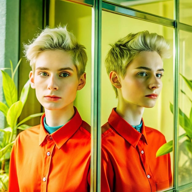
Establishing a distinct color palette is foundational to any successful Instagram style guide. In 2025, as visual content continues to dominate, color grading moves beyond mere enhancement to become a cornerstone of brand recognition. It’s about creating a visual signature that, even without a logo, instantly identifies your content. This consistency helps build a subconscious connection with your audience, making your posts instantly recognizable amidst the endless scroll.
When approaching color grading, consider the psychological impact colors have. Warm tones often evoke feelings of comfort and energy, while cool tones can convey serenity or sophistication. The choice of your primary color scheme should align directly with the emotions and values you wish to project through your Instagram presence. This isn’t about rigid adherence to a single hue, but rather a curated range that works harmoniously across all your visuals.
Developing Your Signature Color Palette
The journey to a consistent feed begins with identifying colors that truly represent your brand or personal aesthetic. This involves more than just picking favorite colors; it requires an analytical approach to how these colors interact with your content and resonate with your target audience. Think about what emotions you want to elicit and what story your colors will tell.
- Analyze Your Brand Identity: What core values and messages do you want your Instagram to convey? Translate these into potential color schemes.
- Study Industry Leaders: Observe how successful brands in your niche utilize color. Note their dominant hues, accents, and overall visual mood.
- Test and Refine: Experiment with different color combinations on a few sample photos. Use Instagram’s grid preview features to see how they look together.
Tools and Techniques for Consistent Color Application
Achieving uniformity in color grading necessitates employing the right tools and techniques consistently. While many apps offer similar features, mastering a select few and understanding their capabilities is far more effective than dabbling in many without a clear strategy. The goal is to replicate your chosen aesthetic across diverse photos taken in varied lighting conditions.
Beyond just using filters, true mastery lies in understanding manual adjustments. Parameters such as whites, blacks, shadows, and highlights play a crucial role in delivering a uniform look. For instance, slightly lifting blacks can give a faded, vintage look, while deepening them provides a more dramatic and modern feel. Similarly, adjusting highlight recovery can salvage blown-out skies or bright objects, ensuring consistency even in challenging shots. The use of split toning or color overlay features can further enhance your desired mood, allowing you to subtly tint shadows or highlights with specific colors.
Harnessing Presets and Custom Filters Effectively
Presets are invaluable tools for maintaining a consistent aesthetic on Instagram. They function as pre-configured sets of adjustments—covering everything from exposure and contrast to color grading and sharpness—that can be applied to photos with a single tap. The true power of presets lies not just in their instant application, but in their ability to ensure visual harmony across your entire feed, regardless of the original image characteristics. In 2025, as content creation becomes even more streamlined, custom presets are paramount for developing a unique and recognizable style.
To effectively use presets, it’s crucial to understand that they are starting points, not definitive solutions. While a preset might look perfect on one photo, it might require minor tweaks on another due to variations in lighting, subject matter, or original image quality. The key is to find a core preset that aligns with your brand’s aesthetic and then learn to adapt it subtly for each shot. This iterative process of applying and adjusting ensures consistency without sacrificing the unique qualities of individual photos.
Choosing or Creating Your Signature Presets
The decision to choose a pre-made preset or create your own hinges on your specific needs and desired level of uniqueness. Pre-made presets offer a quick starting point and often come from professional photographers, providing a proven aesthetic. However, custom presets allow for unparalleled personalization, ensuring your feed is truly one-of-a-kind.
Whether you choose to buy or build, the goal is a preset that reflects your brand. When buying, look for collections that offer variations within a similar style, allowing for flexibility. If creating your own, start by editing a few typical photos until you achieve a look you love, then save those settings. This becomes your base, which you can further refine over time.
Seamless Integration Across Different Lighting Conditions
One of the biggest challenges in maintaining a consistent feed is adapting your editing style to vastly different lighting scenarios. A preset that works beautifully for outdoor daytime shots might look completely off for indoor, low-light, or night-time photography. This is where strategic adaptation comes into play.

Rather than creating a dozen distinct presets, consider developing a few variations of your core preset, each tailored for specific lighting conditions. For example, you might have one version optimized for bright, natural light, another for warm, artificial indoor lighting, and a third for cooler, overcast conditions. This approach allows you to retain your signature style while ensuring each photo is optimally enhanced. Pay particular attention to white balance and exposure when adapting presets, as these are often the most affected by differing light sources.
Curated Content Planning and Visual Flow
A consistent Instagram feed isn’t solely about individual photo editing; it’s about the deliberate arrangement and visual interplay of your posts when viewed together as a grid. In 2025, content planning has evolved beyond simply scheduling posts; it involves a meticulous strategic approach to visual flow, ensuring each new image complements the existing ones. This holistic perspective helps maintain a cohesive narrative, enhancing the overall user experience and making your profile more appealing to visitors.
Developing a strong visual flow requires careful consideration of contrast, color distribution, and the arrangement of subjects within your grid. Avoid posting images that are too visually similar consecutively, especially in terms of composition or dominant colors, as this can make your feed monotonous. Instead, aim for a dynamic balance where each post feels fresh yet undeniably part of a larger story. Utilizing grid preview apps allows you to visualize potential post arrangements before going live, helping you make informed decisions about your feed’s direction.
Understanding Grid Layouts and Patterns
The layout of your Instagram grid significantly impacts its visual appeal and overall cohesiveness. There are several popular patterns, each offering a distinct aesthetic, and in 2025, hybrid approaches are increasingly common. Understanding these patterns allows you to choose one that best suits your content and brand identity, providing a structural foundation for your visual consistency.
Popular grid layouts include:
- Checkerboard: Alternating contrasting photos, often black and white with color, or light with dark.
- Row-by-Row: Each row of three photos tells a mini-story or shares a common theme, color, or composition.
- Column-by-Column: Similar to row-by-row, but vertically, creating three distinct visual columns.
- Puzzle/Mosaic: Individual posts combine to form a larger image when viewed on your profile, requiring meticulous planning.
- Rainbow/Color Block: Gradually shifting color palettes across your feed, creating a visually striking progression.
Previewing and Adjusting Your Feed for Harmony
Even with the best planning, posts can sometimes look different on your grid than they did individually. This is where previewing tools become indispensable. Tools like Later, Plann, and even Instagram’s own draft feature allow you to upload photos and arrange them on a mock-up of your feed before publishing. This crucial step enables you to assess the visual harmony and make necessary adjustments.
When previewing, pay attention to how colors and light interact between adjacent photos. Look for balance and avoid jarring transitions. You might find that a seemingly perfect photo, when placed next to others, throws off your feed’s overall mood. In such cases, minor color adjustments, cropping, or even reordering posts can make a significant difference. Regular use of these preview tools ensures that every new addition enhances your feed’s consistency rather than disrupting it.
Optimizing Sharpness and Detail Preservation
In 2025, high-quality visuals are non-negotiable for an engaging Instagram presence. This extends beyond good composition to include exceptional sharpness and detail preservation. Blurry or low-resolution images can instantly detract from your feed’s professionalism, even if the content itself is compelling. Achieving optimal sharpness involves a careful balance—too little and your images appear soft; too much, and they can look artificial or pixelated.
The key to optimizing sharpness lies in understanding its different facets: capturing sharp images initially, enhancing sharpness subtly during editing, and ensuring that exported files retain that quality despite Instagram’s compression. This multi-stage approach guarantees that your photos consistently look crisp and refined, contributing significantly to a polished and professional feed. Over-sharpening is a common pitfall; it introduces digital artifacts and noise, making photos look unnatural. A nuanced approach, focusing on enhancing natural details rather than creating artificial ones, yields the best results.
Best Practices for Capturing Sharp Images
The foundation of a sharp image is laid during the capture phase. No amount of post-processing can fully compensate for a fundamentally soft or out-of-focus photograph. Prioritizing sharpness from the outset dramatically improves the final output and reduces the burden on your editing workflow.
- Use Good Lighting: Ample light allows for faster shutter speeds, reducing motion blur.
- Stable Camera: Employ tripods or stabilize your phone against a solid surface to eliminate camera shake.
- Achieve Accurate Focus: Tap to focus on your subject when using a phone. For cameras, understand your autofocus settings.
- Optimal Aperture: For landscapes, a mid-range aperture (f/8-f/11) often yields the sharpest results. For portraits, a wider aperture might be used, but ensure your subject’s eyes are in sharp focus.
Strategic Sharpening in Post-Processing
Once you have a well-captured image, strategic sharpening in post-processing can bring out fine details and add that professional crispness. Most editing software includes sharpening tools, but their effective use requires restraint and a targeted approach. The goal is to enhance existing detail, not to create new ones or over-process.
Tools often include sliders for “Amount,” “Radius,” and “Detail.” The “Amount” controls the intensity of sharpening, “Radius” defines the thickness of the sharpened edges, and “Detail” targets the finer textures. A common technique is to zoom in to 100% on areas of interest (like eyes in a portrait) and apply sharpening cautiously, only increasing the “Amount” until details pop without introducing halos or noise. Masking tools can also be invaluable, allowing you to selectively sharpen certain areas while leaving smoother areas, such as skin or skies, untouched. This prevents an artificial, overly textured look and keeps the focus on key elements.
Refining Export Settings for Instagram’s Compression
Instagram’s aggressive image compression can be a bane for content creators, often degrading photo quality, especially sharpness and color fidelity, upon upload. In 2025, understanding and anticipating this compression is a critical component of any effective Instagram style guide. The secret lies in refining your export settings to provide Instagram with an image that is already optimized, minimizing the negative impact of its processing. This proactive approach ensures your carefully edited photos maintain their visual integrity and consistency once they go live.
The primary goal of optimizing export settings is to find the sweet spot between file size and resolution. Instagram automatically resizes images that exceed its preferred dimensions (typically 1080 pixels wide) and applies its own compression algorithms. By exporting your photos at or close to Instagram’s optimal resolution, you can pre-empt some of its more destructive resizing and compression, giving you more control over the final image quality. This attention to detail in the final export phase is often what separates truly professional-looking feeds from those that fall flat.
Optimal Dimensions and File Formats
Choosing the right dimensions and file formats for your Instagram uploads is paramount. While Instagram is continually updating its guidelines, a few consistent best practices have emerged that maximize quality and minimize degradation from compression.
- Square Posts (1:1): 1080 x 1080 pixels.
- Portrait Posts (4:5): 1080 x 1350 pixels.
- Landscape Posts (1.91:1): 1080 x 566 pixels.
Always export your images at 1080 pixels on the longest side to prevent Instagram from resizing them indiscriminately, which often results in a loss of sharpness. For file format, JPEG is the standard, but ensure the quality slider is set to 90-100% to preserve detail without creating unnecessarily large files. While PNGs offer lossless compression, their larger file sizes can sometimes lead Instagram to compress them more heavily.
Minimizing Quality Loss During Upload
Even with optimal export settings, subtle quality loss can occur during the actual upload process. There are a few additional strategies to mitigate this impact and ensure your photos look as close to your edited versions as possible on your feed.
One key tip is to check Instagram’s advanced settings within the app. Sometimes, there’s an option to “Upload at highest quality” or similar, which should always be enabled. Be mindful of your internet connection; uploading over a strong Wi-Fi connection is generally better than mobile data, as a weaker connection might prompt Instagram to further compress your images for faster upload. Finally, after uploading, always view your post on various devices to ensure it looks consistent across different screens. Sometimes, minor color shifts or sharpness variations can occur due to device calibration, though these are usually less severe than compression issues.
| Key Point | Brief Description |
|---|---|
| 🎨 Color Grading | Establish a distinct and consistent color palette across all photos to build brand recognition, reflecting your aesthetic and values. |
| ⚙️ Custom Presets | Utilize or create personalized presets for quick application and consistent visual harmony, adapting them for varied lighting. |
| 🖼️ Grid Planning | Strategically plan your content’s arrangement and visual flow using grid layouts to ensure cohesive storytelling and aesthetic appeal. |
| ✨ Sharpening & Detail | Capture sharp images and use subtle post-processing sharpening to enhance details without artificiality, ensuring professional clarity. |
Frequently Asked Questions About Instagram Style
In 2025, the most crucial aspect is visual consistency, primarily achieved through strategic color grading and cohesive editing. This creates a recognizable brand identity and improves audience recall, making your feed stand out in a crowded digital space. It’s about more than just pretty pictures; it’s about a unified visual narrative.
You should review your Instagram style guide at least semi-annually or whenever your brand’s direction evolves. While consistency is key, stagnation is detrimental. Small, iterative adjustments ensure your style remains fresh, relevant, and aligned with current trends without alienating your existing audience. Regularly assessing what resonates helps keep your content engaging.
Yes, you can use multiple presets, but it’s vital to ensure they are variations of a core aesthetic. For instance, having presets for different lighting conditions (daylight, indoor, night) that all derive from a similar overarching style. This approach prevents visual jarring while offering flexibility. Consistency doesn’t mean monotony, but rather a harmonious spectrum of looks.
Content planning is integral. It involves more than just scheduling; it’s about curating the visual flow of your grid, considering color balance, composition, and thematic progression between posts. Tools for previewing your feed before posting are invaluable. This thoughtful arrangement enhances the overall aesthetic, making your profile more appealing and cohesive to visitors.
Instagram’s compression resizes and compresses uploaded images, which can lead to a loss of sharpness and color fidelity. To mitigate this, export your photos at Instagram’s optimal dimensions (e.g., 1080 pixels on the longest side) and use a high-quality JPEG format. This preemptive optimization helps maintain the visual integrity of your edited photos upon upload.
Cultivating a Lasting Visual Legacy on Instagram
Achieving a consistent and captivating Instagram feed in 2025 is an art form rooted in strategic editing, thoughtful planning, and an unwavering commitment to your unique visual voice. It transcends mere photo enhancement, becoming a deliberate act of brand building. By mastering color grading, leveraging custom presets intelligently, planning your grid’s visual flow, refining sharpness, and optimizing export settings, you are not just posting pictures—you are cultivating a lasting visual legacy. Embrace these secrets, experiment with confidence, and watch your Instagram presence evolve into a powerful, cohesive, and deeply engaging platform that truly reflects your vision and resonates with your audience.


